Posted in Revival Style Guide

Scarf Style For Early Fall

So many antique stores and clothind boutiques alike carry the world’s simplest accessory. Considered a medium scarf or a bandana, these charming, often colorful squares of silk or light cloth remind us all of the creativity and limitless possibilities of self expression that we have.

So what makes these silky square scarves appear in the antiques world? Traditionally, the headscarf has made some strides throughout history. Natives would use these to keep warm, to identify with culture, and as symbols of ethnic or religious preference. They define modesty, integrity, and are often associated with a neat and polished woman. Some people feel liberated by not wearing them, which is fine too. Scaves today remain a statement of every one of these things, but they are also becoming a staple of pleasant weather fashion. Not to mention, in my own experiences, they keep long hair tamed on blustery days (which for those of you who know me personally, can tell just how desperately necesary these are for me and my mop).

So there are a few ways to wear them. There are examples that span most of human cvilization, but let’s see what Google has to offer for Fall 2016. Click here for Scarf Ideas!

For the second picture from the left on the second row (for those of you on your laptop and desktop computers, these styles require a longer scarf than a medium or square to ensure no one chokes themselves trying to tie the bows. The one that I tried out this month is a very basic double-knotted wrap that supports most updo hairstyles, which uses these simple steps:

  1. Select a scarf and begin with your hair already done-up
  2. Put the scarf on your head (just kidding)… fold the scarf diagonally into a triangle, and wrap the middle behind you, holding the two corners of the triangle in your hand.
  3. Use the ends at the top of your head to tie the double knot (or whatever knot you like best). If you haven’t done so already, finish your updo, or take down your hair after the knot is finished. Sometimes hair has a tendency to tangle when it left down while adding a scarf.
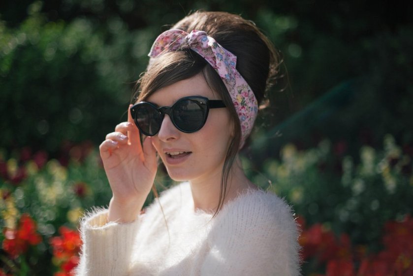
Let us know what else is out there and how the scarves work with every individual hairstyle!

Posted in The Trials of Doris

Going ‘Green’ at the Estate

We have still been hard at work researching and working behind the scenes at The Retro Revival to bring you the latest updates and observations from the Duke Estate. It is a challenge to resist the temptation to stray from the path and explore past the guests’ areas, but rest assured, all of our photographs conform to rules and have been collected from publicly-accessible locations.

So what have we found this time? Here are some of the themes of the day: Green things, indigenous species, and a perfect opportunity to mesh environmental stewardship with history. What a treat it would be to see people working together to preserve the integrity of the estate’s remaining gems….

Check out what our findings have been:


Posted in The Publications

Launching the Traveling Picnic Basket

As of September 2016, the authors at the Retro Revival have decided to start traveling for picnics. What’s so retro about that? The picnic is a symbol of welcome, much like the pineapple is. In the spirit of learning, reporting, and interacting with our readers, we decided that picnicking is the best way to report on locations and people who have amazing stories to tell.The idea of ‘going vintage’ isn’t just at home. The best way to spread a good idea is to share it! So that is exactly what we started doing with a charming, wicker picnic basket.  Granted, there have been spikes in the ‘inner-flower-children’ movements, but picnics are not exclusive to the hippies. Hopefully, these cheerful little occasions that celebrate the everyday pleasantries of life.Certainly, the online community of vintage fans is ever-growing, but any revivalist knows that meeting new people and experiencing life outside the social media world is far more valuable. So, during our travels, we encourage our readers ask where we will be headed to picnic! Become a part of our story!

Our picnics are a time we try to use to catch up, unwind, and forget about the extreme schedules that life demands of students this day and age. The value of a picnic was always its universal nature. Whether you are the king and queen or a peasant, a Duke or a drywaller, or anything in between, a picnic is an eloquent way to relax and appreciate life.

To put a skip in the step of picnicking aesthetics, we began the journey of the Traveling Picnic Basket at Duke Farms. Surely, we will be back soon, but our basket’s first portrait was taken at the gorgeous stone stairs of the Mermaid Pool. Thank you to our amazing partners at the Film Photography Project for getting Clicks the Box Camera in working order for this maiden voyage!

Posted in The Publications

Ronaldo Custom Guitars; Bird’s eye/quilted/flame maple.

You read correctly, I have been working closely with the gentlemen at Ronaldo Custom LLC, and one of my first Warmoth builds was begging for a maple neck, so this is the specimen that got attached to the swamp ash body, making my own Keith Richards style tele!

Very smooth neck, Grover tuners, Ronaldo Custom radius, and vintage style frets. Get in touch with me if you are interested in their instruments.  =]

The short and sweet on this luthier is that he has made custom instruments and done repairs for many major rock acts that include; Mark Wood, Anthrax, The Allman bros. Band, Blue Oyster Cült, and many more!  These a high quantity guitars being made for a cost that falls below most custom shops, with wood options at such a fair price that it is truly a joy to work with this shop to put something together.

Posted in The Trials of Doris

The ToD: Gone, But We’ll Never let you Forget!

Just this morning as we sipped our tea and went about business, there was a spirit of yesteryear lingering close. Just this time last year, we spent Thursday nights piled in houses and resraurants trying to devise a good enough strategy to appeal to boards in Hillsborough Township to prevent the senseless demolition of the Duke Mansion. Whether in hindsight you agree with the environmental-focus of this destruction or you opposed the removal of Miss Duke’s main residence, the facts are that the mansion is no longer standing for a variety of curious reasons.

Of course, one would think that it’s all over. Perhaps our posts following the Trials of Doris are less frequent, but the spirit of the Dukes has only become stronger in the time we have been idle. Just today, Mark DiIonno of the Star Ledger published this gem of an article reminding us all what inconsistencies and curious cases pass through the doors of Hillsborough Township (and elsewhere) all the time. Take a look at what he’s got together:

http://www.nj.com/news/index.ssf/2016/08/same_guys_who_let_duke_mansion_be_razed_protect_an.html

Let’s take a look at some highlights real quick. He’s right, from our perspective. You have our support from The RetroRevival.

“And while the $2 billion Duke Foundation successfully argued their mansion was in disrepair and beyond restoration, and that it was a hodgepodge of insignificant architectural add-ons over the years, the sisters could not convince commission of either. Instead, the commission ruled the “house was in good condition, considering its age” and that “renovations can be performed in a manner consistent with the structures historical significance.”But the main reason for the denial, according to the commission’s official denial resolution, is that the farmhouse is only one of four brick homes of that age in the township. This fact was mentioned not once, but twice. On the flip side, there was only one Doris Duke mansion.But who’s counting?” (DiIonno).

You had ONE chance, and it doesn’t appear that you will be forgotten. Ususally when people ask to be remembered, they hope it would be for a good reason. I regret to inform you that the destruction of the Duke Mansion in Hillsborough New Jersey and every name of those who acted in ways to permit its demolition won’t ever be forgotten. We simply won’t stand aside for injustice.

While the RRBlog does focus its energy on the asesthetics and concepts of years ago, we don’t live in 1951 anymore and we do not, nor will we ever, be bystanders to any sort of social injustice, even toward someone postmortem. #JusticeForDoris


Stay tuned, darlings; and always stay curious.

Posted in The Publications

Clicks’ First Pics!

In early January, I promised my dear readers the opportunity to gauge my experimenting with a box camera named Clicks. Under the generous advice of my darling friend JMCS, I was able to, somewhat-successfully, take pictures with it. The first round got a bit of light exposure, but there are some visible images: they just have their own flavor. Apparently, when a Kodak gives you instructions on the interior of the camera that advises only a specific size spool of film, you sincerely must adhere strictly to it. Otherwise, you’ll suffer a fate of thumb blisters in desperate attempts to turn the spooling knob… like yours truly! If it says no 120, don’t do it! It’s thumb suicide! Anyway, this nifty little camera has had quite a bit of fun in its first months. Until next season, here are the first photographs of the second life of Clicks the camera. Cheers!


Posted in The Publications

The Year of the Pineapple

This year had to be one of the strongest in terms of revivalism of the midcentury tropical motifs. Somehow out of the woodwork, the fruits, flamingoes, palm trees, and other tropical motifs came out SWINGING! Over the course of the summer, The Retro Revival noticed and compiled a grand list of the most prominent motif of the year: The Pineapple. The sheer number of instances that the pineapple appeared has floored us both and we have therefore chosen to crown this summer as the year of the pineapple! Check out the classic motifs compared to the findings of the RetroRevival from this year. Feel like your own dose of the tropics? Here ya go! http://www.modcloth.com/shop/search?keyword=pineapple

There were echoes of yesteryear everywhere, simply updated! Not only the best fruit ever, pineapples have remained a powerful symbol of welcome. The same authentic pineapple strengths are noted all over vintage culture:

Posted in Manny's Music Column, The Publications

MJT Telecaster Build; Part 2


Continuing from last months post, I found quite a few parts that simply worked out to be perfect fits for this guitar, Sound wise the guitar has more of a strat sound because of the pickups I had available. The aged finish on the neck is comfortable and easy to play on, not sticky, and has a certain mojo that a thinner neck finish can facilitate.

some specs;
The neck I ordered was intended to be a copy of my Ronaldo Custom Tele’s original neck (was an ’83 fender tele neck). The 80’s to 90’s C neck profile with a more modern radius (10″ fingerboard radius), Rosewood fretboard,  and Kulson tuners.

The included bone nut was something i needed to take to my guitar tech, but otherwise everything fell perfectly into place.  I really enjoy how worn in the instrument feels, as well as how I can feel the woods vibrate because of the thinner & lack of paint.  Theres a bold character to this guitar that a stock telecaster off the wall simply would not be able to contain.

Posted in Revival Style Guide

The Pastel Comeback

When we look at old pictures, the photo quality has many differences compared to what a photograph looks like now. These trends are so infectious, that many people perceive yesteryears as being bleak, sad, and grey. In fact, the world was just as colorful even if it is difficult to imagine when we are surrounded by aged artifacts. Colors will always play a significant role in our self-expression.

Pastels have been appealing to everyone, (women in particular), as far back as the ancient times. Colors were revered as being the signature of the elite because dyes were more expensive than blank-canvas cottons and wools. So, as time went by, people continued to grow as a society, colored fabrics remained desirable. Fast-forward to Victorian culture: pastels and vivid, embroidered accents were staples of the upper class. As the 20th century came about and economies became improved, the desire for colors and eye-catching patterns followed suit. But pastels? They weren’t left behind. This gentle-on-the-eyes look was most comfortable for the middle class and working class. Although we only got a glimpse into color in 1950s (when cameras began printing in color), it wasn’t just this decade that was pretty in pastels! Sadly, the comfort color were quickly replaced in time for the 1970s and 80s to take over with their neon shades and spandex overhaul.
In the last approximate year or two, pastels have made a strong rebound back into style. Certainly, we consider pastels to be cute and darling, best suited for young children at Easter. These charming palettes come with no age limit, however. So, to prove that pastels can be darling, dazzling, and flattering. I decided to try this out myself with some shopping following a local clothing drive two months ago. It admittedly does take some movement out of the comfort zone at first, but the effect is so gratifying. I wanted to let my amazing photographers know that their efforts are most appreciated. The overall result is that retro is once again the winner over modern. Sorry folks! Pastels are just plain sophisticated and are here to stay! Many thanks to Kohls, Target, and Modcloth for these exceptional springtime stunners!

http://www.unique-vintage.com/vintage-style-dusty-rose-gold-cap-sleeve-scarlett-dress.html

This gallery is owned by RetroRevivalBlog~


Posted in The Publications

Fine Futuristic Furnishings

Ironically, the first generations of ‘futuristic’ furnitures trace back to the 1920s and the middle of the 20th century. The economic comforts of these two approximate eras made for the perfect conditions to turn the eyes of designers toward the horizon. Art Deco  and Postmodern designs look funky even in today’s world. So why was there such a thrill associated with progressive designs at these intervals?

Let’s start with the earlier of the two. Art Deco was more of an economic result. The stock market hadn’t yet crashed when furniture designs became more artistic to their rustic cohort counterparts. Because of the sudden boom of interest in maintaining Americana culture (thanks to the first Red Scare), more unique designs were rolling out of assembly lines. This Art Deco style is characterized by its distinct new lines, curves, and postmodern flair, but still maintains its classic elements. The rather pleasant economy also bolstered the better interest of furniture designers internationally prior to the start of the Great Depression in 1929. Some awesome examples of Art Deco are included here:

http://artdecocollection.com/furniture/ (These guys do a swell job of restoring the classics!)

Another instance (which is probably the most notable era of vibrant colors and wild designs) occurred in the postmodern, postwar America that we knew as the 1950s. With yet another Red Scare (the predecessor of the Korean and Vietnam wars) becoming stronger in mainstream American culture again, there was a correlation that seemed to happen. Now, the entire country’s most chic homes were postmodernized. All the space-age fascination and desire to be three steps ahead of any perceived competing nations really pushed furniture into a new decade of the postmodern design. These are classically associated with midcentury America. Remember the xenon sofas? Perhaps you were a fan of the wood paneling that helped tone down sputnik chandeliers? Maybe you’re more of a sleek-lined modular side table type? All of these are excellent notions of postmodern design. Some were more eccentric than others, but the goal to be futuristic was most valued.

http://www.postmodernhome.com/showroom/new-arrivals/ (Another magnificent restoration job!!!)

Oddly enough, these two bygone eras resonate with today’s concepts of modernity and the future. They share some significant commonalities such as historical placement. They both were characterized as being effects of a postwar economic boom, they correlate with Red Scares, and they share the same need for unique, clean contours and conversation pieces. The love of modern has carried its weight into being one of the largest influences on today’s housewares. Cheers, darlings! Happy decorating~

(Thank you Tomato Factory for our features image of a Danish midcentury chair!)